In the not so distant past, hotel Lobby bars were simply the place where visiting businessmen would meet ladies of the night. But much has changed in a short time, hotels have stepped up the design factor in their lobbies, and the bars have become the hang out for locals on Friday nights. With so many other options, why are locals flocking to hotel lobby bars to get their drink fix? They make you feel at home. They’ve become comfortable, invigorating, exciting spaces – they feed our design fix.
So, why not rip off their best design details? The next time you are at your favourite hotel bar, just remember to keep your eyes open and your favourite camera app on standby.

Lesson One: Go custom
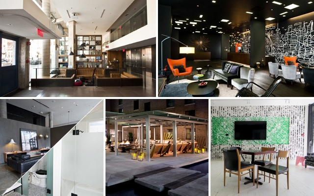
Throw out your Expedit from Ikea shelf and have one built by a local craftsman. The reason this lobby at the Nolitan in New York works is due to the oversized nature of the bookshelf; it runs from floor to ceiling. Create one wall in your living room that is wall-to-wall bookshelves; this is the new wall to do a focal wall. Trust us, ladies will be impressed by the sheer size of it.
—

Lesson Two: Go for it
Instead of opting for a large piece of artwork, pick an over-the-top wallpaper that you won’t easily get bored with in a month or two. As you can probably recall, we told you about wallpaper a few months back; it’s back, bigger and bolder than any paint finish. This custom wallpaper at the Thompson Hotel in Toronto may be a bit pricier but it pays for itself with its impact.
—

Lesson Three: Monochrome is sexy
Every fashion magazine and blogger has recently rediscovered the idea of tonal dressing. Dressing in head-to-toe black or white or even blue is big in the fashion scene at this moment. So now is the time to learn from fashion and incorporate it into your living space. Monochromatic style can make a room feel very manly, inviting, or crazy sexy cool. The Americano hotel in New York (above top) features a tonal black on black lounge. One important lesson to remember: always vary the textures. Using everything from glossy marble to velveteen fabrics or leathers and even wood, will ensure the space still looks and feels interesting.
If dark and sexy tones are too much for you, try all white. Steal ideas from the newest Drake Hotel incarnation, the Drake Devonshire – a hipster heaven in the country. The design team went all white in their well-appointed bathrooms with just a hit of black with the hardware. The key is to use warm whites everywhere: the walls, the upholstery, and even the linens. The hit of black on the hardware feels more modern than traditional chrome.
—

Lesson Four: Outdoors is indoors
If you have an amazing outdoor space, always treat your outside space like an extension of the inside. Welcome to the Rosewood Georgia Hotel in Vancouver; a city that prizes outdoor living above indoor living. Opt for furniture that feels at home indoors or outdoors. Just don’t forget to include great pillows, throws and lighting. Oversized coffee table is great for all your outdoor entertaining. And if you can add in a fireplace or fire pit, go for it. Not only will it remind everyone of being around a campfire, it will extend your space during cooler weather.
—

Lesson Five: Have fun
Add some whimsy. Is that a pink elephant in the corner? Why yes it is. The addition of the classic Eames Elephant adds the element of the unexpected and prevents your room from simply looking like every other design savvy space.

